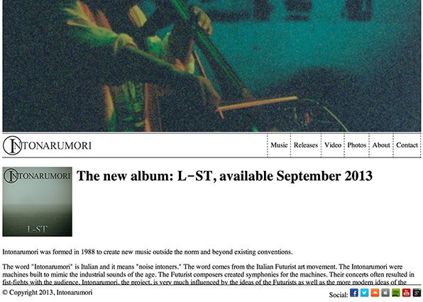
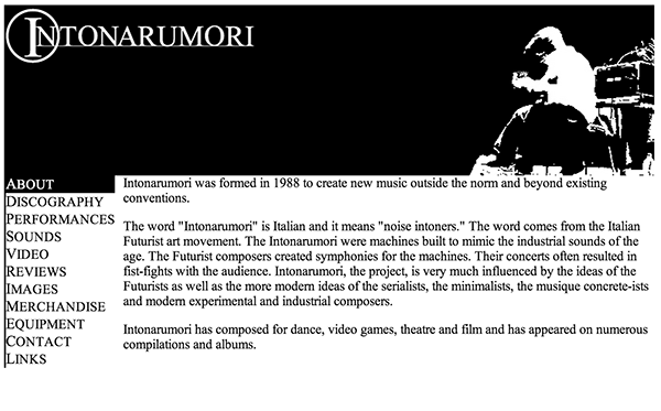
The release of the first Intonarumori album in a few years gave me a good excuse to redo the website and bring it into the modern internet age.
The old site (still available here) had served me well and the design mostly was still working, but since the updates had been infrequent and minor, it seemed like a big redesign would also be a good way to signal that the site (and band) had not been abandoned, just quiet for a while.
The old site was also using a lot of stale HTML tricks (yes tables for layout!). I did do some prototypical responsive design though (resize the window on the old site and watch how the title area resizes smoothly). The site itself also was really bad on mobile devices, and even was using a lot of (horrors!) Flash for audio playback. It had been in place for eight years though, replacing the second design which was from the mid-to-late 90s.
I also thought that the information design was pretty lacking, superfluous information and overly complicated navigation for a musical artist site, ie: way too many pages.
I decided that I was going to try and do it right this time. CSS-based, responsive design, a reasonable layout, retina and mobile ready. I also wanted to follow a true process where I would spend some time sketching and wire-framing before I started in.
I didn’t want to go overly fancy though with unnecessary javascript or dynamic pages, since the site itself should not change too significantly once it is deployed (the last one was in place for eight years).
I spent a bunch of time sketching ideas for layouts and looking at other artist sites to get a better feel for what others had done. Musicians sites are fairly staid I found. Usually relatively minor affairs with a small number of pages and mostly links out to other sites with the content. I didn’t want to make Intonarumori.com into a big destination site, but I wanted to make sure that it had enough information for a curious visitor to get a feeling for the project and it’s output.
Once I had a rough idea of what I wanted to do, I got into coding the first page. I started in with Dreamweaver CS6. I have been using Dreamweaver since it was a Macromedia product, almost since it was released. My earlier sites had been done completely in notepad and e-macs, but I loved being able to do WYSIWYG HTML and having a built-in FTP server. Dreamweaver also has really good CSS. I had been finding its’ limitations though on some projects over the last few years. Especially on sites like kevingoldsmith.com and parts of unitcircle.com where I was mixing PHP elements in. Dreamweaver started to be more of a hinderance than a help there.
I decided that I didn’t want to use Dreamweaver’s built-in support for responsive design. Not that it wouldn’t have made things much easier, but I wanted to really understand how to do it right myself before I started using tools. Also, I had just had to rip out a lot of old Dreamweaver template crap from one of my old sites and I didn’t want to get stuck into anything Dreamweaver-specific.
I did want to use JQuery, so I could learn it better. So, I did use that and I also spent some time looking at different responsive design libraries. They were all a lot more than I needed, so I decided to do stuff myself. Again, a goal was to really wanted to understand responsive design better.
As I got into using more Javascript for messing around with the DOM, Dreamweaver immediately became useless for viewing the content. The split view, which I had really loved, was basically worthless. Dreamweaver became a pretty-good text editor with pretty-bad FTP support added in. (aside: the FTP support in Dreamweaver seems to have been stuck in maintenance mode for the last several releases, which would have been fine if it actually worked well, but it never has). I found myself editing code in dreamweaver and then having to FTP it to my server to test. Dreamweaver used to let you preview in a browser locally, but either that got removed or just moved to where I couldn’t find it. This process became unworkable to me. I decided that it was time to move on to a different process.
I have been using TextWrangler for a bunch of different code editing projects, so I decided to try it out for this. I came up with a new process where I edited the code in TextWrangler, previewed by reloading the page in Chrome, and then pushed it to the server to check on other devices by using SFTP in a terminal window. While this might have seemed like taking a big step backwards, it actually worked ok. At least as well as Dreamweaver, if not a bit better. The lack of code completion was starting to bug me though, and having to type FTP commands constantly was also getting annoying. So, I decided to look into better tools now that I knew I had to drop Dreamweaver.
My first change was buying a copy of Transmit 4. I have to say that I love this app! Being able to mount the webserver as a virtual drive and edit the files directly was awesome as I was messing with the media queries in the CSS and modifying the layout for mobile. It was also amazingly faster and more reliable than Dreamweaver or shell FTP.
I wanted a better editor though and I asked on Twitter to check with the zeitgeist. Of course my pals at Adobe put in plugs for Brackets:
@KevinGoldsmith how are you not using @edge_code or @brackets?! It sounds like exactly what you need.
— Ryan Stewart (@ryanstewart) September 2, 2013
I had known some of the Brackets guys and I liked that Adobe was doing this kind of open source project, so I grabbed a build. For an early build of a code editor, I thought that it was pretty good, but I found some of its quirks a bit frustrating. I was doing a lot of refactoring of layout code at this point and I was finding myself fighting the tool a lot. It was better than Text Wrangler and Dreamweaver, but it wasn’t really working for me. I decided that I need to keep looking. I did like the live update in the browser feature though, that is pretty cool.
Of course I was well aware of Sublime text, but I had never actually tried it. The videos on its site scared me a bit. It seemed way overly complicated for my needs, and the idea of having to use code and to hand-edit preferences files to use a text editor were not really appealing. I might as well have dug up my old .emacs files and started there again. I decided to give it a shot though given multiple recommendations from folks I trust.
@KevinGoldsmith Try Sublime Text and some packages from https://t.co/wAlh9VWN8t. Or try http://t.co/yzPIwg6QsP, bit early thing from Adobe.
— Mattias P Johansson (@mpjme) September 3, 2013
While Sublime isn’t perfect, it is definitely the best one I’ve tried yet and seems to work. I’m using Sublime 2 now, but will probably check out Sublime 3 soon.
I also realized that rather than use my devices all the time to check out how the site worked on mobile I realized I could just use the iOS Simulator that comes with X-Code. That was a massive improvement to my workflow as well.
So new workflow is:
- Edit code in Sublime
- Test in Chrome locally for desktop
- Test in the iOS simulator for mobile
- Push to the web server using Transmit
- Double check on mobile devices
- Use a local version of git for version control
I didn’t mention GIT before, but I’ve been using it on all my sites for a while now. Especially the WordPress ones. In addition to being able to roll-back a site and try out some stuff worry-free, it is also great hacker repair. If any of my sites diverges from the local HEAD then I can figure out what files have been messed with. I haven’t used this to actually use remote repositories as ways to update a site, but I may eventually.
With my workflow in place and a few pages done, I pretty much had the process of building responsively going pretty well.
At first, I was trying to make the site smoothly re-lay itself out for different sizes dynamically. This was way too much work for too little gain as HTML does a pretty good job of that on desktop and it isn’t an issue on mobile. So, after wasting some time on that I switched to doing more with CSS Media Queries. This was fine, but I got way too narrowly-targeted there which meant a lot of work targeting different mobile platforms. Eventually, I switched to having a few basic layout for different widths, roughly one for phones and one for tablets and then one extra one for phones in landscape mode. This worked well on the devices I have, and it kept the effort to be reasonable, but I still need to test on friends devices to make sure.
Now the new site was pretty much done:

There are still some things I’m going to tweak and probably a few issues here and there, but overall I’m happy with it as a new starting point.
There were a couple other resources that I used that I want to give a shout out to. One was the icon set I got from G. Pritiranjan Das. For the photo page, I used the Camera Slideshow JQuery plugin. I also used Matt Kersley’s Responsive Design Testing tool and found it useful.

